
Mixing Metals in Home Decor: Designer Tips & Tricks
Key Takeaways
- Limit yourself to two or three metal finishes, choose a dominant one, and balance warm and cool tones for a cohesive look;
- Polished nickel with brass and matte black with brass are reliable combos. A subtle third finish can work in small accents;
- Keep functions consistent, like plumbing in one finish, vary sheen and texture, and avoid “almost matching” metals in close proximity;
- Use wall art and frames to echo your palette. Mixtiles photo tiles let you test layouts without nails and restick until it feels perfect.
Mixing metals in home decor adds depth, dimension, and a designer feel if you follow a few simple rules. Whether you love the warmth of brass, the glow of polished nickel, or the crisp edge of matte black, you can combine finishes without visual chaos. In this guide, you will learn how many metals to use, where to place them, combinations that work, and common pitfalls to avoid. You will also see how wall art and frames bridge your mixed metal palette with ease.
Bring your metal mix to life on your walls. Create a custom, nail-free gallery with our stickable photo tiles that you can arrange in minutes.
Why is mixing metals in home decor better than matching everything?
Designers mix metals to create interest and balance. Mixing metals:
- Adds visual depth and a layered, modern look that feels intentional;
- Prevents a flat, one-note room by introducing contrast and color temperature shifts;
- Bridges fixed elements like stainless steel appliances or brushed nickel door hardware with accents like lighting and accessories;
- Creates a cohesive story throughout your house when repeated from kitchen to bathroom and living room.
How many metal finishes should you use, and which one leads?
Two is the best rule, and a third can be added as a subtle accent. Choose a dominant finish that appears on the largest or most repeated fixtures, then use a secondary finish for contrast. If you add a third, keep it small, like cabinet hardware or a thin black mirror frame, so the room stays calm and cohesive.
What does “dominant” look like in real rooms?
In kitchens, stainless or brushed nickel often wins by default through appliances and cabinet hardware. Let brass pendants or a matte black range hood be your secondary, and repeat that choice in small accents for sense and balance.
In bathrooms, keep all plumbing fixtures one finish, for example polished nickel or chrome, for a timeless base. Introduce brass in lighting or a framed mirror for warmth, or choose black hardware for crisp contrast that feels new yet classic.
Which metal combinations always work?
The most dependable mixes pair one warm metal with one cool metal, then optionally add a small dose of black for definition. Use the table to find the vibe and placement that fits your space.
|
Combination |
Why It Works |
Where to Use |
|---|---|---|
|
Polished Nickel + Brass |
Nickel has a soft, warm silver tone that complements the golden warmth of brass; |
Faucets and shower fixtures in polished nickel, with brass lighting, cabinet knobs, or a mirror frame. |
|
Matte Black + Brass |
High contrast lines meet warm glow, perfect for modern interiors; |
Black-framed art or black hardware with brass pulls, sconces, and small accessories. |
|
Brass + Polished Nickel + Matte Black |
A tasteful trio when black is minimal and nickel is used sparingly; |
Thin black mirror frames, petite nickel cabinet hardware, and brass pendants or towel bars. |
Polished nickel and brass for warmth without glare

This pair feels refined and timeless. Use polished nickel on wet-area fixtures for durability, then layer antique brass on lighting or cabinet hardware to add color and depth without overwhelming the room.
Matte black and brass for modern contrast

Matte black draws crisp silhouettes that make brass accents glow. A black faucet, black hardware, or black picture frames can anchor the space while brass pendants or a brass mirror add warmth.
The tasteful trio: brass, polished nickel, and matte black

Keep black light and linear, for example in thin frames or a small fixture. Add polished nickel in measured amounts like cabinet knobs so the room does not feel too shiny. Let brass be the star that carries warmth throughout.
How do you balance warm and cool metals like a pro?
Start by pairing one warm metal like brass, bronze, or copper with one cool metal like chrome, nickel, or stainless steel. Then repeat those undertones in wood, textiles, and art so the palette makes sense in every area of the room.
Should you mix textures and sheens too?
Yes, different finishes add dimension. Combine matte, brushed, and polished surfaces for a layered look. Avoid placing two mirror-polished surfaces side by side, which can feel harsh under strong light.
Where should each finish live for the best flow?
Keep functions consistent to avoid visual noise. In one room, make all plumbing the same finish, then use lighting, cabinet hardware, and accessories to introduce your secondary metal. Leave a bit of negative space between similar but different finishes so they do not compete.
What about proximity and scale?
Use larger items, like appliances or main fixtures, in your dominant metal. Keep secondary or third finishes to smaller accents to ensure balance. If two metals are very close in color, separate them or pick a clearer contrast so the mix looks intentional.
Test your palette without commitment. See how your favorite photos look as beautiful canvas prints, which are lightweight and easy to hang. Try the app now.
What mistakes should you avoid when mixing metals?
Dodging a few common pitfalls will keep your interior design clean and cohesive.
- Using too many finishes, which creates a chaotic look;
- Placing “almost matching” metals next to each other, like satin brass beside polished brass;
- Mixing plumbing finishes within the same bathroom or shower area;
- Choosing cheap-looking coatings that break the illusion of quality;
- Ignoring light temperature and undertones, which can make silver, gold, and bronze read off in your space.
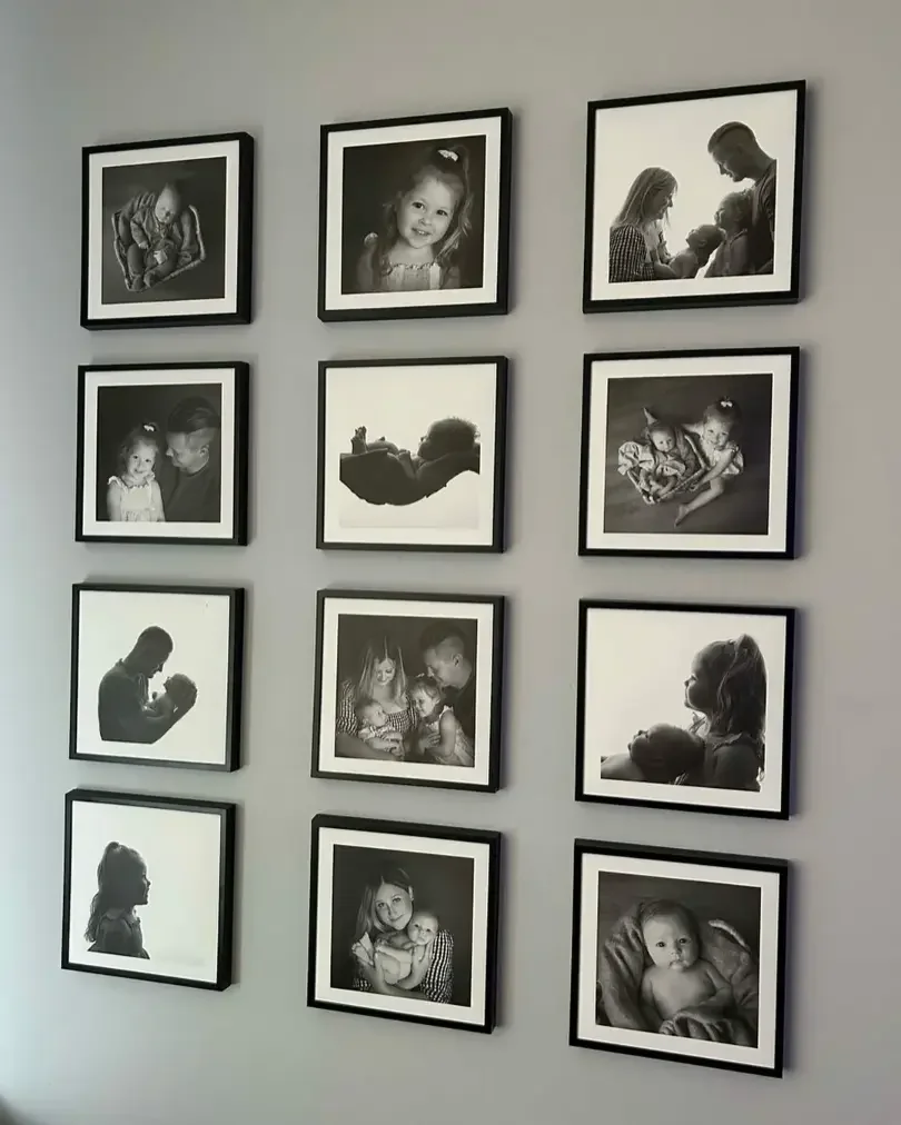
How can wall art help tie mixed metals together?
The right wall arts can bridge colors and finishes, and the right frames echo your metals so everything feels cohesive. This is where Mixtiles shine, since you can choose black, white, or wood-style frames, then stick and restick as your room evolves.
Use frames as a bridge
Pick frame colors that echo your metals. Black frames reinforce matte black details. Warm wood works beautifully with antique brass. A white mat look can calm a mix of different finishes in one area.
Build a gallery wall that honors your metal scheme
Choose imagery with tones that support your palette, for example warm sunset photos beside brass fixtures, or cool coastal shots near polished nickel. Our pre-curated layouts for a photo gallery wall make spacing and alignment easy. For proportions that look intentional, use our wall art size guide, then plan the layout with this step-by-step tutorial on how to arrange art on a wall.
How to plan your gallery wall with mixed metals in mind
Anchor the wall near the largest metal element, like a range hood or a vanity mirror. Place darker frames where you want visual weight, then stagger heights so frames do not mirror reflective fixtures. With peel-and-stick or magnetic mounting, you can refine spacing until the whole room feels balanced. Unsure about eye level in kitchens, hallways, or above sofas? This quick reference on how high to hang art on a wall will keep sightlines consistent.
Mixing metals in home decor is about contrast and consistency working together. Pick a dominant finish, add a complementary second, and if you like, a small third for emphasis. Keep functions consistent, vary sheen, and use art to connect the dots. With Mixtiles wall photo tiles, canvas prints, and gallery wall kits, you can create a beautiful, cohesive room and adjust the look any time as your style evolves.
Ready to finish your mixed metal space? Browse our curated gallery walls for inspiration and create a stunning display you can rearrange any time.
Frequently Asked Questions
Are mixed metals still in style?
Yes. Mixed metals feel polished and timeless when done intentionally. Limit yourself to two or three finishes, choose a dominant one, and balance warm and cool tones. A touch of black adds definition. Echo the palette with wall art and frames for a cohesive look.
Are there metal combinations you should avoid?
There are few hard rules, but skip almost-matching finishes side by side, like polished brass next to satin brass. Watch undertones, cool chrome can clash with warm copper in close proximity. Keep plumbing one finish per room, vary sheen thoughtfully, and separate similar tones.
What is the 3-5-7 rule in decorating, and how does it help with metals?
The 3-5-7 rule groups items in odd numbers for balance and rhythm. Vary height and scale, aiming for a loose triangle. For metals, style vignettes of three pieces, one dominant, one accent, plus a neutral. For gallery walls, 3, 5, or 7 frames create harmony.
Can you use different metals in different rooms?
Yes. Choose a home-wide dominant finish, then vary the secondary by room for personality. Keep plumbing consistent within each room. Repeat undertones in lighting, hardware, and art. Black or wood-look frames, like Mixtiles, help bridge finishes so the whole home reads cohesive.

Be the first to know — deals, news & decor ideas.
By clicking you agree to the Terms of Use & Privacy Policy