
Wall Art Placement: Master Height & Spacing Today
Key Takeaways
- Hang the center of art at 57–60 inches from the floor; when above furniture, position art 6–8 inches above and size it to about 2/3 the furniture width;
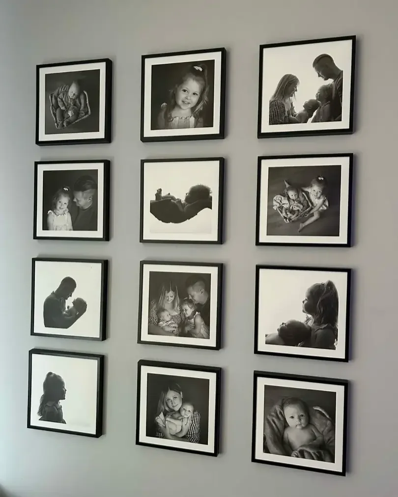
- Keep frame spacing tight and consistent: 2–3 inches between pieces; use grids, pairs, trios, or gallery walls to match your wall size and style;
- Map your layout first, paper templates or the Mixtiles app; then adjust in seconds with Mixtiles’ lightweight, adhesive, and damage-free frames;
- Tailor wall art placement to rooms and tricky spaces (sofas, beds, mantels, hallways, staircases) and elevate results with good lighting and color contrast.
Great wall art placement turns photos and prints into a polished, room-defining moment. Whether you are filling a big blank wall or styling a tight hallway, a few reliable rules make decisions easy: ideal height, right scale over furniture, and simple spacing. This guide breaks down the best layouts, from bold single pieces to perfect grids and gallery walls, and shows how Mixtiles’ adhesive, repositionable frames let you hang, adjust, and refresh without nails, tools, or wall damage.
Create your layout in minutes. Open the Mixtiles app to turn your photos into beautiful photo tiles, preview arrangements on your wall, and get them delivered ready to stick and restick.
What’s the ideal height for wall art placement?
The sweet spot is museum eye level. Center your art at 57 to 60 inches from the floor. If you hang art over furniture or a mantel, keep the bottom edge 6 to 8 inches above, and treat groups as a single unit centered in that same zone. For more room-by-room nuances, see our guide on how high to hang art on a wall.
What is the eye-level rule?
For a single piece on an empty wall, place the center of the artwork at about 57 to 60 inches from the floor. This keeps the visual focus in a natural sightline so your room feels calm and cohesive. For grouped art, measure the overall arrangement, find the vertical center point, then set that center at eye level. Think of your gallery as one large painting and it will always look intentional.
When should you break the rule?
There are smart exceptions:
- In rooms with very tall ceilings, nudging the center a bit higher can balance the visual weight of the wall.
- In kids’ rooms or play spaces, lower the center so little ones can enjoy the art.
- Over mantels, start 4 to 8 inches above the shelf, then check that the overall center still reads near eye level.
- If a sofa or headboard is unusually tall, preserving the 6 to 8 inch gap will usually look better than forcing a strict 57 inch center.
How big should art be over sofas, beds, and consoles?
As a rule of thumb, the best size is about two thirds the width of the furniture below. Keep the bottom of the artwork roughly 6 to 8 inches above the furniture so the composition reads as one connected scene.
What’s the best width and height?
Width matters most for balance. If your sofa is 84 inches wide, aim for an arrangement about 56 to 63 inches wide. For beds and consoles, apply the same idea. Height should feel comfortable and connected, which is why the 6 to 8 inch gap works well above sofas, headboards, and buffets. When in doubt, scale up or use multiple tiles to increase visual presence. Mixtiles offers several sizes, so you can build a layout that fits your room and style.
Still debating scale? Our article on how big should art be on a wall walks through more examples and quick math.
|
Furniture |
Typical Width |
Recommended Art Width, ≈ 2/3 |
Example Mixtiles Layout |
|---|---|---|---|
|
Sofa |
84 in, 213 cm |
56–63 in, 142–160 cm |
Three 20 × 20 in tiles, about 60 in total width plus 2 in gaps, or a 3 × 2 grid of 12 × 12 in tiles to scale wider. |
|
Queen Bed |
60 in, 152 cm |
40–45 in, 102–114 cm |
Three 12 × 12 in tiles in a row, about 36 in plus two 2 in gaps, or two 20 × 20 in tiles for a bold look. |
|
Console/Buffet |
48 in, 122 cm |
32–36 in, 81–91 cm |
Three 11 × 8 in tiles in a row, about 33 in plus two 2 in gaps, or a 2 × 2 grid of 8 × 8 in tiles. |
Room-by-room sizing tips
- Over a sofa, consider a single large focal piece or a tight row of three tiles that spans roughly two thirds of the sofa width.
- Over a bed, a horizontal piece or a trio above the headboard works well, and the same 6 to 8 inch gap keeps it comfortable.
- Over a console, pairs or a small grid feel refined, and they match the furniture’s visual weight without overwhelming the wall.
How far apart should frames be for a clean, designer look?
For most layouts, 2 to 3 inches between frames looks clean and intentional. Larger pieces can breathe at 3 to 4 inches. Whichever gap you pick, keep it consistent so your wall reads as a single composition.
What’s the go-to spacing?
Start with 2 inches between small and medium tiles. This keeps the eye reading the grouping as one unit rather than scattered pieces. If your tiles are larger, increasing to 3 inches can improve clarity without breaking cohesion. With Mixtiles, you can place a pair, step back, and adjust the gap in seconds until the spacing looks just right.
How does spacing change by layout?
Pairs and trios feel balanced when centers align horizontally or vertically. Use the same gap between each piece and keep top or bottom edges flush for extra polish. Grids shine with perfect symmetry, so measure once for a consistent gutter vertically and horizontally. Organic gallery walls can mix sizes and orientations, but hold a uniform gap throughout so the collection still feels unified.
Which wall art layout fits your space and style?
Choose a layout that supports your room’s purpose and your personal style. Minimal rooms often suit a single statement piece. Balanced rooms love pairs or trios. Modern spaces look great with grids, while eclectic homes shine with organic gallery walls.
Want a clean, minimal statement?

Try one large piece that anchors the room, like one of our stunning canvas pictures. Position it at eye level on an empty wall or center it above furniture. A single bold photo, a serene landscape, or a color-forward painting can set the tone for the entire space.
Prefer balanced symmetry?

Pairs and triptychs deliver order. Two equal pieces over a console look hotel crisp. A trio above a sofa creates rhythm. Keep gaps consistent and align centers for a refined, visual cadence.
Love structure and impact?

Grids produce instant gallery vibes. A 3 × 3 grid of Mixtiles reads modern and architectural, especially on large walls. Measure once, then stick and restick until every line feels level. The result is a strong design element that organizes the whole room.
Crave personality and movement?

Organic gallery walls let you mix portraits, travel shots, and small art prints. Start with an anchor tile and orbit smaller pieces around it. Maintain a consistent gap, and keep the overall center near 57 to 60 inches for a grounded look.
Working with nooks, shelves, and mantels?

Lean a larger piece on the mantel, then layer a smaller tile in front for depth. In bookcases, add small framed photos to break up rows of spines. Built-ins come alive when you vary heights and use negative space to let focal pieces breathe.
How do you plan a gallery wall without stress?
Map it on the floor, pick a clear centerline at 57 to 60 inches, and use an anchor piece to guide the rest. The Mixtiles app helps you visualize and auto-space, so you can preview how it will look on the wall before you hang anything. For step-by-step templates and spacing tricks, explore our tutorial on how to arrange art on a wall.
What’s the fastest planning method?
Choose a largest tile to serve as your anchor. Arrange remaining tiles on the floor to test composition, paying attention to spacing and visual weight. If you prefer a template, trace frames on paper, cut them out, and tape them on the wall. This dry run removes guesswork before you commit to a layout.
How do you map the wall?
Mark a centerline at eye level with painter’s tape, usually 57 to 60 inches from the floor. Decide how high and wide your arrangement will be, then pencil in reference marks for the top edges and the gaps. If you are building a grid, measure one perfect column and row, then use those as your baseline for the rest.
Can you skip tools and holes?
With Mixtiles, yes. The adhesive or magnet system lets you hang, straighten, and reposition without nails. Stick a tile, step back for a visual check, and adjust it in seconds until the alignment feels perfect. If you prefer a full walkthrough, here is exactly how to hang wall art without nails.
Build a stunning photo gallery wall in the Mixtiles app. Choose a grid or organic template, auto-space your tiles, and see a live preview before you order.
What about hallways, staircases, and other tricky spaces?
Keep centers at eye level in hallways, follow the rise of the stairs on staircases, and scale down in tight spaces. In bathrooms and kitchens, protect art from steam and splashes. If you rent, adhesive photo tiles are an easy, damage-free choice.
Hallways and narrow spaces
Hallways are best for linear stories. Think photos from your last travel photo book or family milestones in a tidy row. Keep centers around 57 to 60 inches for comfortable viewing on the move. Smaller tiles look proportional and allow for 1.5 to 2 inch gaps without crowding the wall.
Staircases
Mirror the angle of the handrail. Establish a diagonal centerline and keep the centers of each piece roughly parallel to the rail. Maintain consistent gaps between frames along the rise, and anchor the arrangement with a slightly larger piece at eye level on the landing if you have one.
Bathrooms and kitchens
Choose materials that do well in humid or high-traffic zones. Mixtiles prints are framed without glass, so glare is minimal, and they are easy to wipe with a dry, soft cloth. Position tiles away from direct splashes, and add lighting to boost visibility over tile or textured walls.
Renters and damage-sensitive walls
Mixtiles are designed to stick and restick without damaging the wall. They work on painted walls and many textured surfaces, and they are a simple solution when you cannot drill. If a surface is very rough, press firmly for a few seconds to help the adhesive grip.
How do lighting and wall color affect wall art placement?
Lighting and color can elevate your arrangement. Add accent light to focal pieces and aim for contrast between frames and the wall so your art stands out at any time of day.
Lighting tips
Use sconces, picture lights, or directional lamps to highlight important pieces and reduce shadows. Avoid placing glossy prints directly opposite windows that create glare. If you have bright daylight, consider matte finishes and slight angle adjustments so each artwork reads clearly from the main viewing position in the room.
Color and contrast
Dark walls recede, which makes artwork appear luminous. Light walls feel airy and gallery-like. Match frame colors to finishes in the room, or choose a contrasting frame to define edges on busy surfaces. If you are mixing art and photos, a consistent frame or border color unifies the collection without limiting your style.
What common wall art placement mistakes should you avoid?
A few small adjustments can transform the look of your walls. Use these quick checks to dial in a more polished result.
- Hanging too high: Bring centers down to 57–60 inches for natural sightlines;
- Choosing pieces too small: Scale up or group multiple tiles to fit larger walls;
- Inconsistent spacing: Keep the same gap throughout a layout for cohesion;
- Ignoring furniture width: Target about two thirds the width below for balance;
- Skipping a plan: Map the wall first to avoid redoing work, Mixtiles makes re-hangs painless.
Can Mixtiles make wall art placement easier?
Yes! Mixtiles were designed to simplify how to hang art at home. Lightweight tiles with adhesive or magnetic mounting let you hang, adjust, and swap photos without tools or wall damage, and the app helps you preview designs before you commit.
Why Mixtiles for layouts and gallery walls?
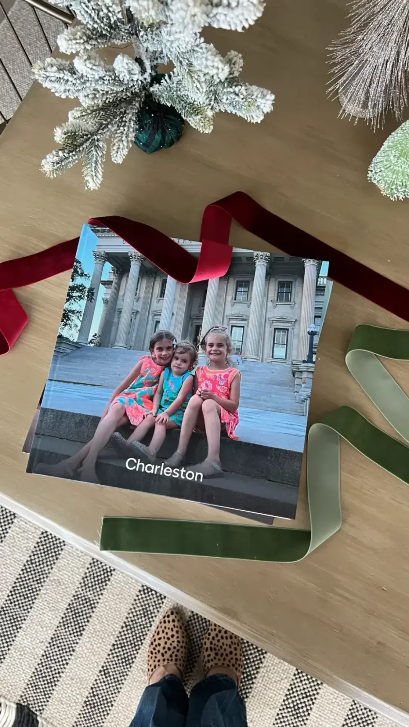
Repositionable frames mean you can experiment until it looks perfect. Sizes range from 8 × 8 inches to 27 × 36 inches, so building grids, pairs, and trios is simple. Gallery Wall Kits give you curated templates when you want a designer look in minutes. Order on the website or app, upload from your camera roll or cloud, and your tiles arrive ready to go on the wall. Clean with a dry, soft cloth, and when you are ready for a new look, peel up, move, and restick.
Perfect wall art placement is about simple rules, eye-level height, right scale over furniture, and consistent spacing, plus the freedom to tweak until it looks just right. Whether you love clean grids, balanced pairs, or collected gallery walls, Mixtiles helps you plan, place, and adjust with zero stress. Design your layout, stick your tiles, and enjoy a polished look that can evolve as your space and style change.
Ready to style your wall? Explore our collection of custom canvas prints or build your layout in the app to get beautiful, damage-free photo tiles delivered to your door.
Frequently Asked Questions
What is the two-thirds rule for hanging art over furniture?
The two-thirds rule helps scale art above furniture. Aim for artwork or a grouping about two-thirds the width of the sofa, bed, or console, and keep the bottom edge 6 to 8 inches above. This creates a balanced composition that feels connected to the furniture.
Where should I position art on a wall?
On an empty wall, center the artwork at 57 to 60 inches from the floor. Over furniture, center the art over the furniture, not the wall, and follow the two-thirds width guideline. Keep spacing consistent between pieces, usually 2 to 3 inches for a clean look.
What does the 57 inch eye-level rule mean?
The 57 inch rule sets the center of the artwork at average eye level, usually 57 to 60 inches from the floor. It keeps sightlines comfortable and cohesive. Adjust slightly for tall ceilings, children’s spaces, or tall furniture, and treat gallery walls as one centered unit.
What is the rule of thirds in art, and does it affect placement?
The rule of thirds is a composition guideline for photos and paintings, not a hanging height rule. It places key elements along imaginary thirds to create movement. For wall placement, prioritize eye-level height, two-thirds width over furniture, and consistent spacing, then use thirds to style asymmetrical groupings.
Be the first to know — deals, news & decor ideas.
By clicking you agree to the Terms of Use & Privacy Policy